Thursday, September 2, 2010

NASDAQ Confirms New Rally

According to Investors Business Daily, yesterday's market action, particularly on the NASDAQ, confirmed that a new rally in the stock market has begun. It will be important to watch carefully for distribution during the next several business days to ensure the rally will not be a false positive.

There are some important characteristics about this follow through that make the staying power of this rally more compelling. The market began its institutional accumulation on Friday with significantly higher volume. It then traded lower for the following 2 trading sessions on very low volume and followed through with significantly more accumulation volume yesterday. This is a classic 4 day rally attempt and success that has lead to some of the strongest and lasting rallies in history. Although there is no guarantee that this rally will be one of those great rallies, it has potential.
To ensure this rally's survival, the NASDAQ and leading stocks must continue to lead the market. The DOW and S&P 500 should follow through in the near future, adding to the overall market strength.
The NASDAQ July low of slightly below 2100 points and subsequent August retest of this low may prove to be the last time this index ever trades at these levels.

Friday, August 27, 2010

Market Finishes Strong


The market continued to build on higher volume today straight into the finish. Small caps, transports, materials and energy were in the lead with defensive sectors lagging the market. Today was a positive day all around.

Several emerging market ETFs made great gains on high volume. The iShares MSCI Malaysia Index (EWM) posted new 52-week highs.

Treasuries and Bonds not so safe


Volume is up huge and climbing on the major US indicies today after the Bernake comments and the quarterly GDP report.

I'm sure the bears will suggest this is simply short covering and that we should expect new lows. I'm not so sure. Bonds prices and treasury yields are down on huge volume today. We may be observing the formation of a long term double bottom in treasury yields which could hold for years. The iShares 20-year Treasury Bond ETF (TLT) is essentially the inverse of the 10-year treasury yield chart. Long term bond prices attempting to retest of their multiyear highs in classic long term double top formation.
The above charts illustrates how fear drives cash to safety in panic driven fashion. When fear subsides and normalcy returns, money flows out of these "safe" investments in an equally rapid nature.

Thursday, August 26, 2010

Declining Volume


Although not illustrated particularly well in the above chart, it would seem that volume has declined on the S&P 500 and the other major indicies since the initial spike in volatility around the period of the flash crash. As I mentioned in a previous post, the market is trading in an apathetic fashion with little conviction in either direction. Volume has been very low in general, declining with each successive leg down since the end of April. Consequently, I'm not convinced we're going directly into the abyss as the daily headlines would suggest. I think, September will be an interesting month for the market.
If you like this article and/or others in this blog feel free to subscribe via e-mail or RSS feed located on the right side of the page.
Thanks,
Shawn

Canadian vs. US Financials


The distance between key technical support and resistance levels post financial crisis is and should be more notable in the financial sector than any other sector. In March 2009, it really looked like the Financial Select Sector SPDR (XLF), which more or less tracks the US financial services sector, was going to zero. It bottomed at $5.73 in March 2009 and currently stands at $13.44. It is currently trading in a downward fashion toward support at ~$12-12.50. If this support level breaks significantly, there really is no other significant technical support in between it and the bottom.
The iShares CSN S&P TSX Capped Financials Index (XFN.TO), which more or less tracks the Canadian financial services sector, appears to be in much better shape than its US counterpart but has the same support gap problem. Support exists around ~$19-20, but below that who knows? One would have to look back to 2004 to see a small trading range where some support may exist around $17.
I think both of these charts are going to be restricted to large trading ranges for months. The XLF faces tremendous resistance at $20 and will only break through it when a strong recovery is underway.

A Global Depression?


The iShares Global 100 (IOO) which tracks the S&P Gobal 100 Index, is essentially a picture of the global economy on one chart. It consists of 100 large cap international stocks. It is to the world what the DOW is to the United States. Several of its holdings are DOW components due to the dominant presence of the US in the global economy.

We can see from the chart that after a sharp recovery from March 2009 to Jan 2010, the chart has faltered and has retested break out level support at $50. We could test this strong support level again or trade at or near it for a period of time. A break below this support level would signal another global recession and a break below $40 would signal a global depression.

Economics is a progressive discipline, not a regressive discipline. Economies learn from past mistakes and become more efficient as time progresses, not less efficient. It is true that history seems to sometimes repeat itself as bubbles form and subsequently burst intermittently. However, this is due to the nature of human psychology, not ecomonics. Progress is cumulatively exponential in nature. The long term trend is always up.

Despite the intensely negative media reports, looking back 10 years from now, this could be the greatest buying opportunity of a generation.

Wednesday, August 25, 2010

Gold


There is no question that both of these charts are still in long term uptrends. Gold bullion alone (GLD) has significantly outperformed the iShares Gold ETF (XGD), which consists of gold stocks, since the 2008 market crash.

The reason for this may be two fold. Fear of owning equities in general is high. Perhaps some investors are afraid of owning stocks at all, even if they are gold stocks. Second, equities tend to outperform the underlying related commodity in the early phase of a trend whereas the commodity outperforms the related equities in the late phase of a trend. This was observed during the climb in oil related stocks relative to the rise then subsequent fall in the price of oil.

It is important to remember that gold doesn't "do" anything. It doesn't create a product, deliver a service, employ people, expand it's operations, diversify, innovate, beat earnings expectations, participate in merger activity, pay a dividend, increase value for its shareholders, contribute to an economy or change the way people and societies live. These are things that companies do. Gold is simply a yellow metal.

Someday, the price of gold will fall. I think we may be in the 6th or 7th inning for the rise of gold.

Manulife


Before the financial crisis, the investment community used to use words like "conservative" and "value" to describe the financial services sector, which includes the big banks and insurance companies. I think it is now appropriate that words such as "volatile", "speculative" and "casino-like" be used in financial service sector mutual fund and ETF prospectuses.

Fortunately, I've never been really interested in the financial services sector due to the fact that I'm more of a younger and growth oriented investor. I feel sorry for all of the yield chasing conservative investors who included companies like Manulife in their portfolio thinking it was a stable long term "conservative" investment.

Below is the chart of a company whose sector is often described as "volatile" or "speculative".


Value Line Arithmetic Index


According to Wikipedia, the Value Line Composite Index is composed of all of the companies that are included in the Value Line Investment Survey. There are currently 1,626 companies included in the index that are publicly listed on the following exchanges:
American Stock Exchange - 8 companies
NASDAQ - 511 companies
New York Stock Exchange - 1,087 companies
Toronto Stock Exchange - 20 companies

I can't find an ETF that tracks this index. Let me know if you can.

The Good Depression

Things seem very bad right now.

All of the news media is extremely negative. This latest correction has very quickly brought all of the superbear doom and gloom economists (i.e. David Rosenberg, Nouriel Roubini, Eric Sprott, Robert Prechter, etc.) out of the woodwork once again to preach about The Demise of the United States, the Elimination of the Middle Class, the Continuing Decline of the US Housing Market, Rising Unemployment, and the fact that gold is the only safe place to be. There is even talk of war to stimulate the economy. It's almost as though there is a competition among analysts to see who can be the most negative or create the best negative brand. You may recall that the opposite was true in 2000, when it was cool to be positive.

Technically speaking, Japan has been in a "depression" since 1990. Currently, the Nikkei is en route to retest its 2008 bear market lows. If this correction worsens, Japan will lead us into the abyss. Fortunately, despite being in a 20+ year depression, Japan is a very nice place to live. They have the world's longest life expectancy, the best social programs for its citizens and are a much more culturally cohesive society that Europe or the west. I'd like to live in Japan, despite it being in a depression.

Yesterday, on the Lang and O'Leary exchange, Amanda Lang questioned David Rosenberg as to what an ordinary investor can do to protect themselves during another depression. Although Mr. Rosenberg may be a well seasoned and respected economist, his answer was poor. He argued that we're likely two thirds the way through this secular bear market which began in 2000. He recommended adopting laddered bond strategies to maximize yield and adopting long / short equity strategies to protect from a declining stock market. I'm skeptical that these strategies actually work to provide better than average returns over the long run. As a general rule, the more complex your investing strategy is, the poorer your long term results. I'd like to know David Rosenberg's 10-year portfolio return.

At least we'll know we're at the end of the Good Depression when the big banks start routinely selling laddered bond funds and long / short equity mutual funds to retirees.

Tuesday, August 24, 2010

VIX


The volatility index (VIX) remained above 20 for most of the period between 1998 and 2003 during which time the technology boom completely unwound. The VIX spiked above 20 in late 2007 when the financial crisis began and has remained elevated since, dropping below 20 only briefly. It currently stands at 27. If history is to repeat itself, we may have a while to go before the VIX falls and remains below 20 for an extended period of time. This may be many months away but would indicate that confidence has returned to the equity markets for the long term and that a new bull market has truly begun. We are likely to experience sideways or range bound trading in the meantime.

Market In Correction?


According to Investors Business Daily, the market has experienced a high enough number of distrubution days relative to accumulation days to make the liklihood of a correction in the US indicies likely. Depending on how today plays out, they may issue a "market in correction" verdict in their Big Picture column later today.

They may be correct. We could experience another correction. However, the intensity of selling this time is reminding me of the May 2006 correction rather than the 2008 crash. I think the downside this time is limited given where we stand currently. It will be difficult for the DOW and S&P 500 to spend a significant amount of time below their important respective psychological 10 000 and 1000 point levels. Any significant move below these levels, should bring in institutional value investors in addition to technical support buyers.

Monday, August 23, 2010

Solar Energy


"If we could harness only 0.03% of the sun's light, we would have more than enough energy to power the entire planet"

This is a remarkable statement made by more than one scientist on the solar energy debate. Although solar energy is far more expensive to produce than other sources currently, we could be close to a tipping point where it becomes much more competitive and efficient.

This ETF is obviously not pricing in a solar energy revolution. In fact, solar energy stocks were crushed along with all energy stocks during the 2008 market crash. Currently, solar ETFs seem to be trading in a similar fashion to other energy related ETFs. The Market Vectors Solar ETF (KWT) is a relatively new ETF with little price history. Its major holdings are listed below.

TOP 10 HOLDINGS (67.25% OF TOTAL ASSETS)

Company
Symbol
% Assets
Canadian Solar Inc. CSIQ 4.18
First Solar, Inc. FSLR 9.64
MEMC Electronic Materials, Inc. WFR 10.16
Q-CELLS QCE.BE 4.48
RENEWABLE ENERGY REC.OL 11.45
SOLARWORLD SWV.BE 4.14
SunPower Corporation SPWRA 4.45
Suntech Power Holdings Co., LTD STP 9.47
Trina Solar Limited Sponsored A TSL 4.82
Yingli Green Energy Holding Com YGE 4.46

If solar energy is to become the dominant energy source in the not-so-distant future, solar energy related stocks should start to be priced less like energy stocks and more like technology stocks. I anticipate that traditional energy stocks will lag the market for some time. Solar energy companies should eventually prove to be market leaders sometime in the future.

Is the internet neutrality argument really important?

There seems to be an ongoing debate surrounding the prioritization of internet bandwidth and whether or not priority access to greater bandwidth should able to be paid for. What the net neutrality advocates are overlooking is the big picture.

In The Singularity Is Near, Ray Kurzweil illustrates that the following characteristics of the internet are true:

Wireless Internet and phone services price performance (increasing exponentially)
Number of Internet hosts (increasing exponentially)
Bytes of Internet traffic (increasing exponentially)
Internet backbone bandwidth (increasing in a very terraced, quasi-exponential manner)

I fail to see how attempting to charge for priority access to bandwidth have any impact on the internet as a whole over the long term. In the short term, some of the small people may be short changed while big corporations pay for the best access. But over the long term, there will be more than enough virtually free bandwidth available than we could ever use.

Market Drift

2004 through 2005 was a relatively boring time for the stock market. The S&P 500 stood at ~1150 give or take a few points at the beginning of 2004 and stood at ~1250 a the end of 2005. This resulted in a mere gain of ~4% per year for this 24 month period. I realize that this is much better than the ~50% decline that most markets experienced in 2008, however, modest returns and normalcy in the market tend not to excite investors.

As the slow recovery in the US continues, the markets over the next year or two will probably provide less excitement than we've been used to lately. It is possible that the S&P 500 simply moves sideways or delivers very modest gains as extremely high unmployment in the US continues to wear investor confidence and dampen consumer spending during this slow recovery period. After the very deep 1973-74 bear market / recession, the S&P 500 traded in a sideways fashion for approximately 5 years.

Of course, there will be sectors or contries that will experience more than simply modest growth. From a technical perspective, several emerging market ETFs are still clearly in uptrends. The iShares Malaysia ETF (EWM) posted new 52-week highs today.

Sunday, August 22, 2010

Canadian Real Estate Prices


The above chart nicely illustrates the fact that Canadian real estate prices have appreciated significantly for 10 straight years, correcting briefly during the great recession. As this graph climbs higher, owning a new home becomes increasingly expensive relative to renting. Notice that in 1989, real estate prices peaked and entered a 10 year period of price consolidation during the tech boom of the 1990s. The smart money left the real estate market and went into the stock market -- technology stocks in particular. The smart money left the US real estate market in 2008. The price-to-rent index in Canada can't climb indefinitely. Last summer appears to be a potential top in Canadian real-estate as prices are down markedly this summer in metropolitan areas such as the GTA , Vancouver and Montreal. It is possible that history will simply repeat itself and we may experience a prolonged period of stagnation as the speculators become frustrated with the Canadian housing market.

The more important question is where will the smart money head next?

Friday, August 20, 2010

Mid-Term Election Year


This year is a much talked about mid-term election year. As we all know, North American equity markets usually post a major multiyear low during the later part of a mid-term election year.


Have we seen the lows for the year or will the market move down sharply through September as it does in a typical mid-term election year? It really could go either way at this point. From a technical perspective, this year has played out in classic fashion. Support has held well on the DOW at ~10 000, dipping slightly below 9700 in July. If this year follows the mid-term election pattern, we could see the DOW make a low at ~9000, at which there is strong technical support. So was the July low, the multiyear low for the markets or are we going to fall into correction again and make new lows through September?

The problem with this mid-term election year is that it is the primary focus of the media more so than any other mid-term election year. Every stock analyst is referring to this year as a mid-term election year and drawing attention to the fact that a correction could be around the corner. Pessimism is elevated, the VIX is elevated but wavering, the Put/Call ratio is elevated, 10-year treasury yeilds are at record lows, bonds are overbought and there is still a ton of cash sitting on the sidelines.

The real question is whether or not there are enough sellers left to push the market to a new low.

Brazil


The EWZ has been one of the leading ETFs in terms of performance for the past several years. After the worst recession in the US in 70 years, this ETF is almost retesting its old highs. A snapshot of a growing economy.

How Low Will Japan Go?

An index to a country is what an ECG is to a heart patient. The Nikkei clearly illustrates that Japan has been in cardiac arrest since a major heart attack in 1990 following years of dietary excess.

Despite the fact that from a technical perspective it appears that all of the damage has been fully priced into Japan's economy, it is unlikely Japan will rebound dramatically anytime soon. Japan as an economy is still facing challenges greater than anywhere in the world. Their rapidly ageing population, lack of immigration, enormous debt to gdp ratio will hold their growth rate at a relatively low level for the forseeable future. Japan is a classic example of a perfect storm of problems that grind an economic system to a halt.

Putting things in perspective, Japan is simply in a really bad 20-year secular bear market that may be reaching its conclusion. It is important to realize that the run up prior to the decline that began in 1990 was faster and greater in intensity that the 1920s DOW or the 1990s NASDAQ. Growth was not modurated in Japan during this period. The chart went straight up. It only makes sense that the subsequent bear market would be deeper and longer as their economy consolidates.

I don't know enough about the fundamentals of Japan to make any predictions about a recovery. I do appreciate the fact, though, that the chart tells an interesting story.

Thursday, August 19, 2010

Where is the market headed?


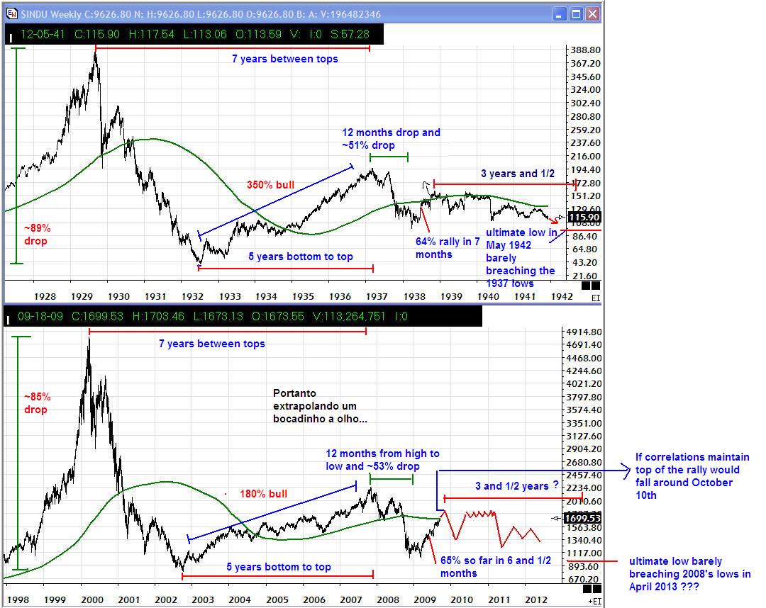
It is remarkable how much the 1930s DOW chart resembles the NASDAQ 2000s chart. The boom and bust nature of the roaring 20s and the technology boom of the 80s and 90s illustrates the fact that human psychology remains at least one constant in the stock market.

From their inception, both the early DOW and NASDAQ experienced years of uninterrupted growth before making their final parabolic moves and then subsequent crashes. The DOW took 12 years to fully "correct" before resuming a long term uptrend that began in 1942. We are 10 years into the NASDAQ's long term period of price consolidation. The real question is how much more time is required for the NASDAQ to fully consolidate and are we headed lower first?

One striking difference between these two charts is the magnitute of their second bull run after their massive crashes. After correcting 89% from its peak, the DOW broke out of a 3 year base pattern and moved up 380%. The DOW subsequently came back to test the 100 point level in 1938 and one final time in 1942 after which a long term uptrend resumed. The NASDAQ, however, moved up a mere 180% after its crash only to break support and retest its crash lows in 2009.

What does this mean? After a significant 380% rebound, it took two retests of the 1935 break out level support at ~100 to wash out all weak investors and the DOW to finally break out in 1942 and never look back. With respect to the NASDAQ, all of the weak holders were washed out in 2008 by a near retest of the 2002 crash lows. A second retest of the 2002 crash lows is unlikely. Support is more likely to hold near 2000 points or slightly below this level. The chart above suggests the NASDAQ will lack direction and drift to the old lows. I don't think so but anything is possible.

So perhaps it takes a year or two more before the NASDAQ defines itself as the true market leader once again. What's more important is the long term uptrend that will follow. In approximately 60 years, the DOW surged 1000% or two exponential steps. It stood at 100 points during the 1940s, moved up by one exponential step to 1000 points during the 1970s, and subsequently moved by another exponential step to 10 000 points by the year 2000. Each exponential move required approximately 20 years to complete, followed by a 10 period of price consolidation.

The NASDAQ currently sits at ~2000 points. By 2020 the NASDAQ should make one exponential step to 20 000 points and then enter a period of price consolitation during the 2030s. The uptrend will then resume in approximately 2040 with the NASDAQ reaching a remarkable 200 000 points, a second exponential step, by 2060 give or take a few years.

What's more interesting is where the other indicies will be given these time frames. Following the same trend, the S&P 500 and DOW shoud reach 10 000 and 100 000 points respectively by 2030. The following exponential step would bring the S&P 500 to 10 000 points and the DOW to a whopping 1 million points by the year 2060.

Sounds silly right? Imagine, how many people would have believed you if in 1942 with the Great Depression fresh in the entire world's mind, you made a prediction that the DOW which then stood at a mere 100 points, would reach 10 000 points by the year 2000?

This is the nature of exponential growth.

Wednesday, August 18, 2010

The Exponential Growth of GDP

Not even the Great Depression was able to permanently interrupt the exponential growth rate of US GDP.    Recall that a straight line on a logarithmic scale represents an exponential trend.  Notice how during the 1930s, the economic system looked as though it had "run off the rails" literally, yet the 1940s quickly corrected deviation from the trend with explosive growth.


Global GDP growth passed the "knee of the curve" during the Industrial Revolution of the 1950s, 60s and 70s.  This is significant due to the fact that growth after this point in the chart, the "exponential" portion of the curve, will be seemingly explosive and unpredictable.  We are experiencing this today as the rest of the developing world becomes fully developed (i.e. the BRIC countries and other emerging ecomomies.).

The nature of exponential growth in trends of this nature is often unpredictable past a point known as the Event Horizon.  It is difficult to imagine what global growth will represent past this point.  What happends when the entire globe is equally developed?  What will the economy seem like when growth that took decades to occur in the past, occurs within weeks or months.  Projections become difficult past the event horizon and it itself is difficult to pinpoint.

I can assure you that we are not entering a global depression or a DOW retracement to 1000 points as some of the doomsday analysts are suggesting.  This makes no rational sense based on growth trends that have been in place for hundreds of years.

Biotechnology

The iShares Biotechnology ETF (IBB) appears to be recently completed a multiyear period of price consolidation.  Notice the significantly higher low during the 2009 basing period relative to the 2003 basing period.  It's recent multiyear high is very bullish.

iShares Nasdaq Biotechnology ETF (IBB)
Top holdings
Amgen, Inc. 9.13%
Teva Pharmaceutical Industries, Ltd. ADR 6.78%
Celgene Corporation 6.17%
Gilead Sciences, Inc. 5.72%
Vertex Pharmaceuticals 3.62%
Genzyme Corporation 3.61%
Biogen Idec, Inc. 3.20%
Alexion Pharmaceuticals, Inc. 2.83%
Perrigo Company 2.79%
Illumina, Inc. 2.76%

Technology

"People tend to overestimate what they can achieve in the short term and underestimate what they can achieve in the long term"

I'm sure many authors have used this quote in a variety of contexts.  It is a recurring theme in the stock market, manifesting itself as a variety of boom and bust cycles.  The roaring 20s can be described as an overestimation in the short term of industrial and financial service supply which corrected during the 30s.  The trend did resume of course, and the industrial revolution of the United States was the long term result.  The dot-com boom and bust was the short term overestimation of the evolution of information technology which may have fully corrected.

Tuesday, August 17, 2010

Go Where The Growth Is

Although Kevin O'Leary's views are often harsh and controversial, I have to agree with his comments on a recent segment of the Lang and O'Leary Exchange regarding relative GDP growth.  Brazil (EWZ), Singapore (EWS), South Korea (EWY), Malaysia (EWM), Mexico (EWW), Taiwan (EWT) and China (FXI, EWH) all have low debt-to-gdp ratios and high absolute GDP growth.

http://en.wikipedia.org/wiki/List_of_sovereign_states_by_public_debt

http://en.wikipedia.org/wiki/List_of_countries_by_external_debt

These ETFs are all outperforming the S&P 500 with some posting 52-week highs.  These charts give absolutely no indication of a pending double dip recession, global deflation or bear market.

Canada (EWC) actually doesn't look bad relative to the US or Europe, but will only provide modest returns as a whole relative to the above mentioned "emerging" economies...

A great ETF and market summary page can be found here:

http://stockcharts.com/def/servlet/Favorites.CServlet?obj=msummary&cmd=show,iday[Y]&disp=SXA

Market Review

I've learned to really dislike market days like today.  NASDAQ up 43 points at one point, then...  out of gas.  I know the market finished higher on the day, yet still disappointing.  A typical summer up day with little volume to convince me of the move either way.  Fortunately, market action lately has shown a lack of selling conviction rather than a lack of buying conviction.  I'm still optimistic, however, that this summer will not repeat that of 2008 and fall off a cliff in September.  Investor sentiment has reached an extremely low level with negative news about the US economy outweighing anything else.  Of course, this is a positive sign based on an intuitively contrarian view of the market.

http://www.market-harmonics.com/free-charts/sentiment/investors_intelligence.htm

As shown in the sentiment charts found above, the bull/bear spread bounced of zero 2 weeks ago and is trending higher.  With the VIX desperately trying to hold its 200-day MA it is clear that the bears are struggling.  Given the fact that we are in a mid-term election year, I would imagine that most of the "smart" fund managers are waiting for the market to retest or make new lows in Sept before adding to any positions.  Since this is the obvious move, I think the market will outsmart the seasonal, presidential cycle guys and continue to bore investors by continuing to grind higher on lower volume for the rest of the summer.

Hello

Hi.  This is my first day as a blogger or as someone who writes in a blog.  I became interested in the concept of blogging after reading Matthew Good's blog and other blogs by investment analysts that I follow and correspond with.

I hope to use this blog to express my opinions of the current stock market environment and to look for insight as a market investor, topics surrounding the evolution of information technology and how it continues to radically impact our lives at an accellerating pace, the evolution of social networking and the eventual ubiquity of the internet, various political issues in the news today, issues surrounding the profession of pharmacy (I'm a practising community pharmacist), the evolution of health care, contemporary music (I'm an experienced guitar player) and various other topics.  Seems like a lot for one blog doesn't it?

I invite all to comment and express their opinion on any topic I write about.

Shawn